Matplotlib vs Seaborn: Which Python Charting Tool Should Beginners Use?
Start here: the real difference between Matplotlib vs Seaborn
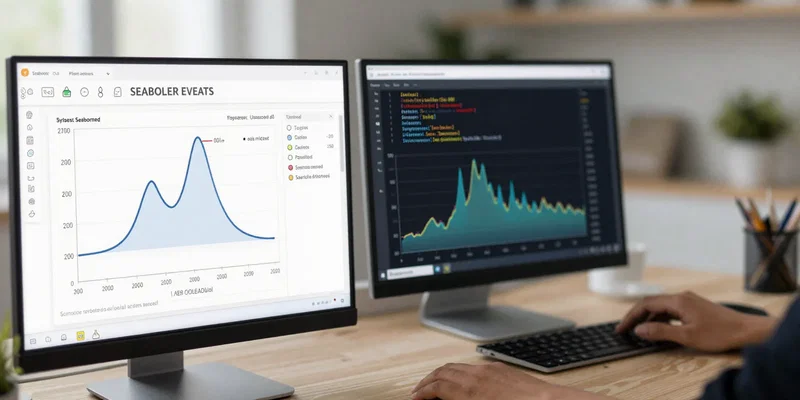
When people search for matplotlib vs seaborn, they usually want a simple answer: which one should I learn first if I’m new to Python charts? The short version is this. Start with Seaborn if you want better-looking charts fast. Learn Matplotlib right after, because it’s the foundation underneath a lot of Python plotting and it gives you far more control when your chart needs stop being basic.
That’s the practical beginner answer, not the purist answer. Seaborn feels friendlier because it smooths over a lot of the annoying setup. You can get a chart that looks decent with less code, and that matters when you’re still learning data types, DataFrames, and how plotting works at all. Matplotlib can feel more mechanical at first. More knobs, more decisions, more chances to wonder why your labels overlap or why your figure size looks weird. But it’s also the engine room. If you stay in data work long enough, especially in an analyst workflow where you’re tweaking reports for stakeholders, you will run into cases where Seaborn alone isn’t enough.
If you want quick wins, Seaborn is the easier first step
For beginner Python charts, Seaborn has a big advantage: it helps you make something readable before you fully understand every plotting option. That’s huge when you’re trying to build confidence. You can feed it a pandas DataFrame, point it at a couple of columns, and get a chart that already looks presentable. Nice defaults. Better color palettes. Smarter handling of categories and statistical relationships. Less wrestling.
It’s also better at answering common beginner questions without making you build everything manually. Want to compare categories? Seaborn does that well. Want a scatter plot with a trend line? Easy. Want to see distributions or grouped comparisons? Also easy. In other words, it aligns nicely with how people actually start exploring data. You’re usually not designing a publication-grade custom figure on day one. You’re trying to understand what’s in the dataset and communicate a few findings without spending an hour on formatting. That makes Seaborn one of the most approachable data visualization tools for new analysts and students.
Matplotlib takes more effort, but it teaches you how charts actually work
Matplotlib is not harder because it’s worse. It’s harder because it exposes more of the plotting machinery. You deal more directly with figures, axes, labels, legends, limits, styles, and layout. At first, that can feel like friction. Later, it feels like freedom. Once you understand the basics, you can bend Matplotlib to do almost anything: fine-tuned annotations, custom subplot layouts, unusual axis behavior, layered chart elements, export settings for reports, and all the little details that matter when a chart is going in front of clients or leadership.
That’s why I wouldn’t tell beginners to skip it. Seaborn is the smoother on-ramp, but Matplotlib is the language you eventually need for precision. A lot of Seaborn charts are built on top of Matplotlib anyway, so learning the underlying system helps even when you keep using Seaborn. If your chart title needs to sit just right, if your legend needs to move, if you want to combine several visuals into one figure, or if you need full control over styling for a report template, Matplotlib stops being optional pretty quickly.
For real analyst workflow, the best answer is usually both
Here’s the thing: in a real analyst workflow, this usually isn’t an either-or decision. It’s a sequence. Seaborn for fast exploration. Matplotlib for cleanup, customization, and edge cases. That’s how a lot of people actually work, even if tutorials tend to frame the tools like rivals in a boxing match.
Say you’re exploring sales data, survey results, or marketing performance. Seaborn helps you get to answers faster because its plotting functions pair nicely with tabular data and common business questions. Once you know what story the data is telling, you might switch into Matplotlib mode to control spacing, brand colors, annotation placement, chart dimensions, or subplot arrangements for a slide deck. That workflow is efficient because you’re not overengineering the first pass, and you’re not stuck with defaults when the chart needs to look polished. For beginners, that’s worth understanding early: the smartest workflow is often not choosing one tool forever, but knowing when each tool saves you time.
What each library is best at when you’re still learning
If your goal is to make common charts quickly and avoid ugly defaults, Seaborn is usually better at the start. It shines with scatter plots, box plots, violin plots, heatmaps, grouped bar charts, pair plots, and distribution plots. It also tends to make comparisons across categories feel more natural. For a beginner who wants charts that look like they belong in a modern notebook instead of a 2009 software manual, that matters.
Matplotlib is great for fundamentals and flexibility. Basic line charts, bar charts, and simple time-series visuals are fine in Matplotlib, and learning them there teaches you concepts that carry over everywhere else. It’s also stronger once you need unusual formatting or a chart type that doesn’t fit the standard “quick analysis” mold. If you care about understanding axes, ticks, figure sizing, plotting layers, or export behavior, Matplotlib is the better teacher. So the beginner choice depends on what kind of beginner you are. If you want momentum, start with Seaborn. If you want to understand the mechanics from the ground up and don’t mind a steeper first week, start with Matplotlib. Most people will enjoy the first path more.
The simplest learning path for beginners who don’t want to waste time
If I were advising a new Python user today, I’d keep it simple. First, learn Seaborn well enough to build the charts you’ll use most often: scatter plots, bar charts, histograms, box plots, and heatmaps. Use it with pandas. Get comfortable mapping columns to x, y, hue, and faceting. Learn how to read the plot and explain what it shows. That gets you into actual data visualization work quickly instead of drowning in formatting trivia.
Then spend time with Matplotlib basics: figure and axes, titles and labels, legends, figure size, subplots, saving figures, and annotation. Not every parameter. Just the parts that give you control. Once you have that combination, you’re in a strong spot. You can make beginner Python charts without pain, and you can refine them when a manager, client, or professor asks for something more specific. If you only learn Seaborn, you’ll eventually hit walls. If you only learn Matplotlib first, there’s a decent chance you’ll spend more energy fighting chart setup than learning to see the data. Starting with Seaborn and adding Matplotlib is the path that feels most useful, fastest.